Create a ggplot2 plot from the output of summariseInObservation()
Source:R/plotInObservation.R
plotInObservation.Rd![[Deprecated]](figures/lifecycle-deprecated.svg)
Arguments
- result
A summarised_result object (output of
summariseInObservation()).- facet
Columns to face by. Formula format can be provided. See possible columns to face by with:
visOmopResults::tidyColumns().- colour
Columns to colour by. See possible columns to colour by with:
visOmopResults::tidyColumns().
Examples
# \donttest{
library(dplyr)
library(OmopSketch)
library(omock)
cdm <- mockCdmFromDataset(datasetName = "GiBleed", source = "duckdb")
#> ℹ Loading bundled GiBleed tables from package data.
#> ℹ Adding drug_strength table.
#> ℹ Creating local <cdm_reference> object.
#> ℹ Inserting <cdm_reference> into duckdb.
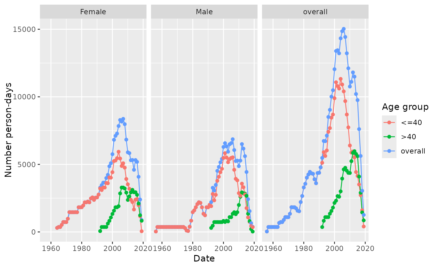
result <- summariseInObservation(
observationPeriod = cdm$observation_period,
output = c("person-days", "record"),
ageGroup = list("<=40" = c(0, 40), ">40" = c(41, Inf)),
sex = TRUE
)
#> Warning: `summariseInObservation()` was deprecated in OmopSketch 1.0.0.
#> ℹ Please use `summariseTrend()` instead.
result |>
filter(variable_name == "Person-days") |>
plotInObservation(facet = "sex", colour = "age_group")
#> Warning: `plotInObservation()` was deprecated in OmopSketch 1.0.0.
#> ℹ Please use `plotTrend()` instead.
 cdmDisconnect(cdm = cdm)
# }
cdmDisconnect(cdm = cdm)
# }