![[Deprecated]](figures/lifecycle-deprecated.svg)
Arguments
- result
A summarised_result object (output of
summariseRecordCount()).- facet
Columns to face by. Formula format can be provided. See possible columns to face by with:
visOmopResults::tidyColumns().- colour
Columns to colour by. See possible columns to colour by with:
visOmopResults::tidyColumns().
Examples
# \donttest{
library(omock)
library(OmopSketch)
cdm <- mockCdmFromDataset(datasetName = "GiBleed", source = "duckdb")
#> ℹ Loading bundled GiBleed tables from package data.
#> ℹ Adding drug_strength table.
#> ℹ Creating local <cdm_reference> object.
#> ℹ Inserting <cdm_reference> into duckdb.
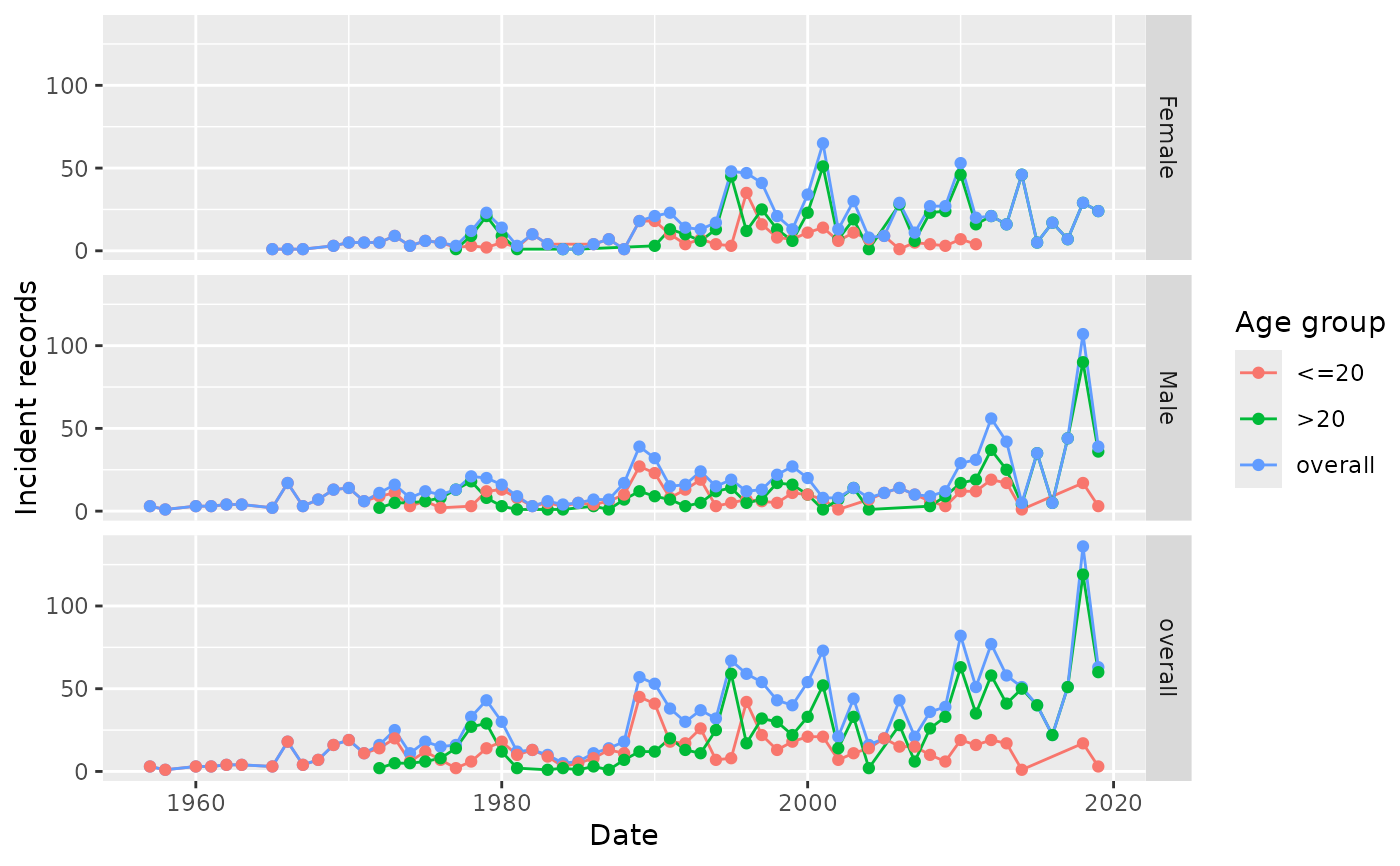
summarisedResult <- summariseRecordCount(
cdm = cdm,
omopTableName = "condition_occurrence",
ageGroup = list("<=20" = c(0, 20), ">20" = c(21, Inf)),
sex = TRUE
)
#> Warning: `summariseRecordCount()` was deprecated in OmopSketch 1.0.0.
#> ℹ Please use `summariseTrend()` instead.
plotRecordCount(
result = summarisedResult,
colour = "age_group",
facet = sex ~ .
)
#> Warning: `plotRecordCount()` was deprecated in OmopSketch 1.0.0.
#> ℹ Please use `plotTrend()` instead.
 cdmDisconnect(cdm = cdm)
# }
cdmDisconnect(cdm = cdm)
# }