Introduction
This vignette demonstrates how to use table and plotting functions provided by MeasurementDiagnostics to visualise results.
We use the package mock data so examples are fully reproducible.
library(MeasurementDiagnostics)
library(dplyr)
library(omopgenerics)
library(ggplot2)

cdm <- mockMeasurementDiagnostics()

# Example codelist we'll use in the examples
alkaline_phosphatase_codes <- list("alkaline_phosphatase" = c(3001467L, 45875977L))
Create diagnostics results
We call summariseMeasurementUse() once and obtain
histogram bins for all numeric variables. This returns a
summarised_result containing all the diagnostics checks,
summary estimates, and density and histogram estimates to visualise
distributions of numeric variables; all for the overall measurements
codelist and stratified by sex.
result <- summariseMeasurementUse(
  cdm = cdm,
  codes = alkaline_phosphatase_codes,
  bySex = TRUE,
  byYear = FALSE,
  byConcept = FALSE,
  histogram = list(
    days_between_measurements = list(
      "0-30" = c(0, 30), "31-90" = c(31, 90), "91-365" = c(91, 365), "366+" = c(366, Inf)
    ),
    measurements_per_subject = list(
      "0" = c(0, 0), "1" = c(1, 1), "2-3" = c(2, 3), "4+" = c(4, 1000)
    ),
    value_as_number = list(
      "low" = c(0, 5.999), "mid" = c(6, 10.999), "high" = c(11, Inf)
    )
  )
)
Tables
There is one table function corresponding to each diagnostic check:
tableMeasurementSummary()— subjects with measurements, counts per subject, days between measurements.tableMeasurementValueAsNumber()— numeric value summaries (by unit where available).tableMeasurementValueAsConcept()— frequency of concept values.
You can customise which columns appear in the header, which are used as grouping columns, and which to hide.
# 1. Measurement summary table (timings / counts)
tableMeasurementSummary(
  result,
  header = c("codelist_name", "sex"),
  hide = c("cdm_name", "domain_id")
)|
Codelist name
|
|||||
|---|---|---|---|---|---|
|
alkaline_phosphatase
|
|||||
| Variable name | Variable level | Estimate name |
Sex
|
||
| overall | Female | Male | |||
| Number subjects | – | N (%) | 67 (67.00%) | 40 (40.00%) | 27 (27.00%) |
| Days between measurements | – | Median [Q25 – Q75] | 249 [67 – 645] | 240 [53 – 1,133] | 267 [81 – 415] |
| Range | 8 to 2,886 | 8 to 2,886 | 8 to 2,743 | ||
| Measurements per subject | – | Median [Q25 – Q75] | 1.00 [1.00 – 2.00] | 1.00 [1.00 – 2.00] | 1.00 [1.00 – 2.00] |
| Range | 1.00 to 4.00 | 1.00 to 4.00 | 1.00 to 3.00 | ||
# 2. Numeric-value summary table (values recorded as numbers)
tableMeasurementValueAsNumber(result)| CDM name | Unit concept name | Unit concept ID | Variable name | Estimate name |
Sex
|
||
|---|---|---|---|---|---|---|---|
| overall | Female | Male | |||||
| alkaline_phosphatase | |||||||
| mock database | kilogram | 9529 | Measurement records | N | 50 | 33 | 17 |
| Value as number | Median [Q25 – Q75] | 8.77 [7.07 – 10.48] | 8.12 [6.60 – 10.22] | 9.13 [8.26 – 11.17] | |||
| Q05 – Q95 | 5.70 – 11.84 | 5.58 – 11.60 | 6.64 – 11.83 | ||||
| Q01 – Q99 | 5.43 – 12.11 | 5.41 – 11.99 | 6.08 – 12.11 | ||||
| Range | 5.36 to 12.18 | 5.36 to 12.04 | 5.94 to 12.18 | ||||
| Missing value, N (%) | 2 (4.00%) | 2 (6.06%) | 0 (0.00%) | ||||
| NA | - | Measurement records | N | 50 | 27 | 23 | |
| Value as number | Median [Q25 – Q75] | 8.77 [7.10 – 10.44] | 8.55 [6.85 – 10.01] | 8.92 [7.39 – 10.88] | |||
| Q05 – Q95 | 5.77 – 11.77 | 5.75 – 11.32 | 6.18 – 11.80 | ||||
| Q01 – Q99 | 5.50 – 12.04 | 5.61 – 11.94 | 5.59 – 11.93 | ||||
| Range | 5.44 to 12.11 | 5.58 to 12.11 | 5.44 to 11.96 | ||||
| Missing value, N (%) | 3 (6.00%) | 3 (11.11%) | 0 (0.00%) | ||||
# 3. Concept-value summary table (values recorded as concepts)
tableMeasurementValueAsConcept(result)| CDM name | Variable name | Value as concept name | Value as concept ID | Estimate name |
Sex
|
||
|---|---|---|---|---|---|---|---|
| overall | Female | Male | |||||
| alkaline_phosphatase | |||||||
| mock database | Measurement records | Low | 4267416 | N (%) | 34 (34.00%) | 16 (26.67%) | 18 (45.00%) |
| High | 4328749 | N (%) | 33 (33.00%) | 26 (43.33%) | 7 (17.50%) | ||
| NA | NA | N (%) | 33 (33.00%) | 18 (30.00%) | 15 (37.50%) | ||
Plots
The plotting helpers allow to plot certain types of graphics, while
giving flexibility for variables to use for colouring, facetting, and
which to have in the horizontla and vertical axes. They return
ggplot objects, which allows further customisation using
standard ggplot2
layers.
Measurement summary
plotMeasurementSummary() visualises
days_between_measurements, and
measurements_per_subject. Supported plot type are
"boxplot", "barplot", and
"densityplot".
The variable specified in y must be either
“days_between_measurements” or “measurements_per_subject” as it is used
to filter which of the summary results to plot.
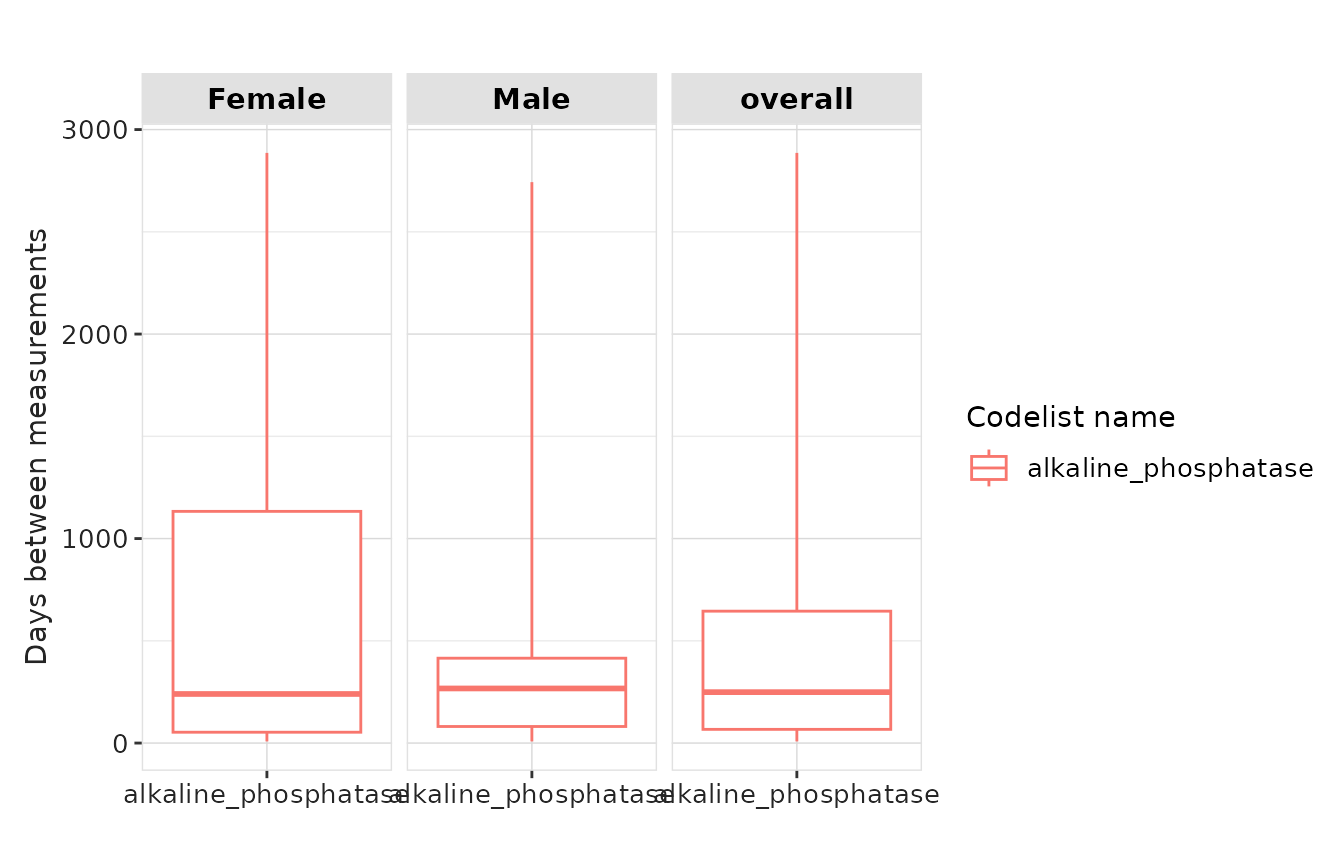
result |>
  plotMeasurementSummary(
    x = "codelist_name",
    y = "days_between_measurements",
    plotType = "boxplot"
  )
result |>
  plotMeasurementSummary(
    x = "sex",
    y = "measurements_per_subject",
    plotType = "boxplot",
    colour = "sex",
    facet = NULL
  ) +
  theme(legend.position = "none")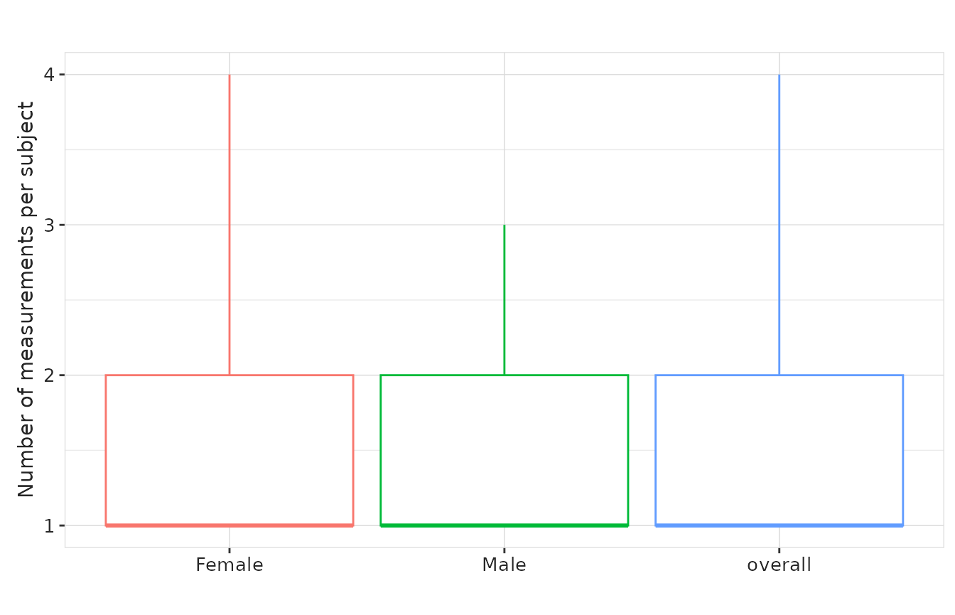
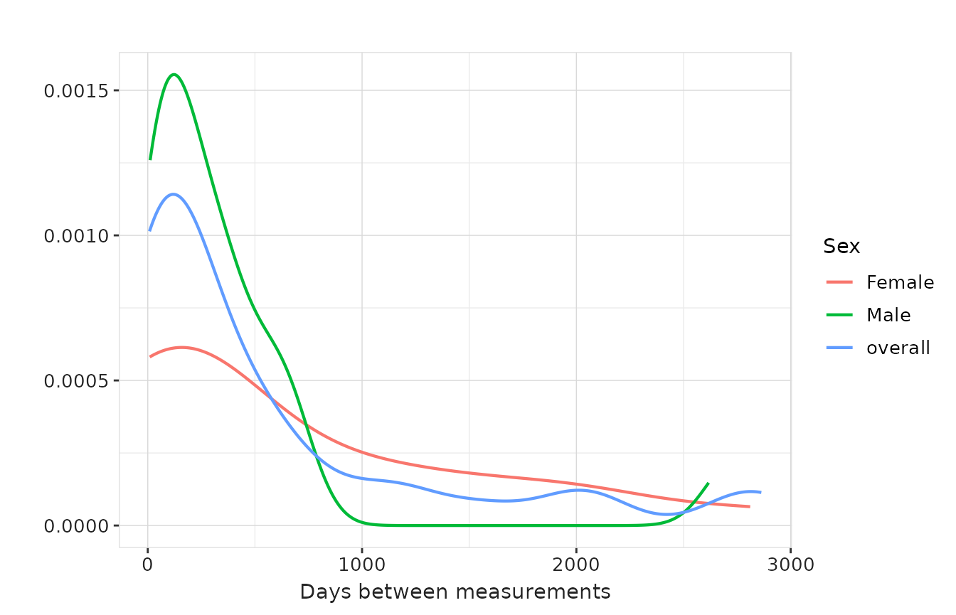
If we got density estimates we can also use
densityplot for these variables. To choose which variable
to plot, we use the y argument, while the x
argument is ignored for this plot type.
result |>
  plotMeasurementSummary(
    plotType = "densityplot",
    colour = "sex",
    facet = NULL
  )
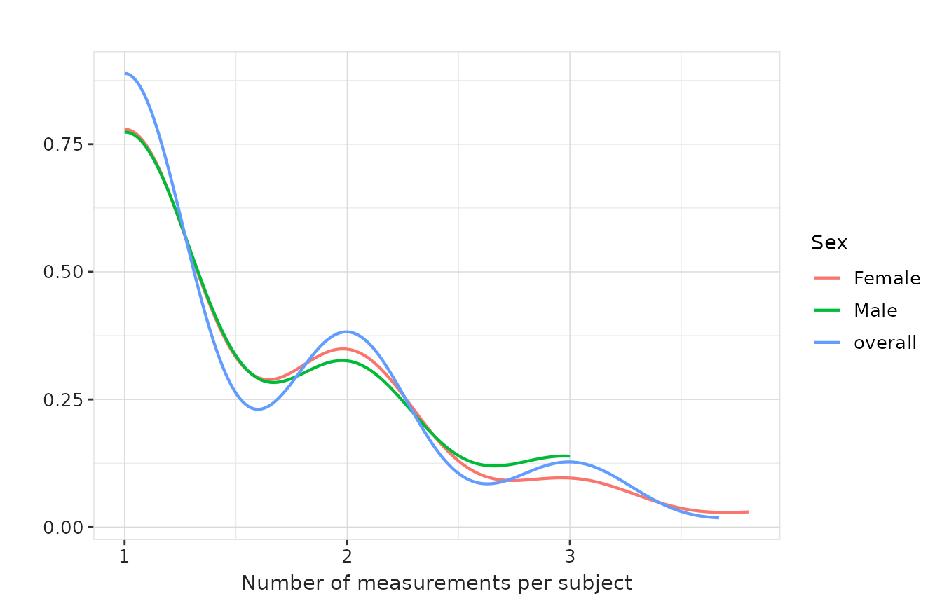
result |>
  plotMeasurementSummary(
    y = "measurements_per_subject",
    plotType = "densityplot",
    colour = "sex",
    facet = NULL
  )
Since we got specific bin-counts to plot histograms for these
variables, we can also use plotType = "barplot"
result |>
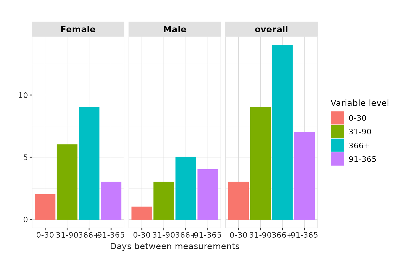
plotMeasurementSummary(
x = "variable_level",
plotType = "barplot",
colour = "variable_level",
facet = "sex"
)
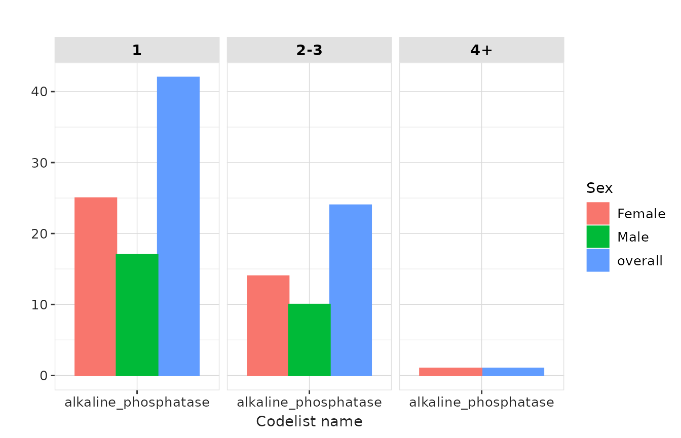
result |>
  plotMeasurementSummary(
    y = "measurements_per_subject",
    plotType = "barplot",
    colour = "sex",
    facet = "variable_level"
  )
Numeric-value summary
plotMeasurementValueAsNumber() visualises distributions
of numeric measurement values. We demonstrate the three plot types,
similar to the measurement summary plots.
boxplot
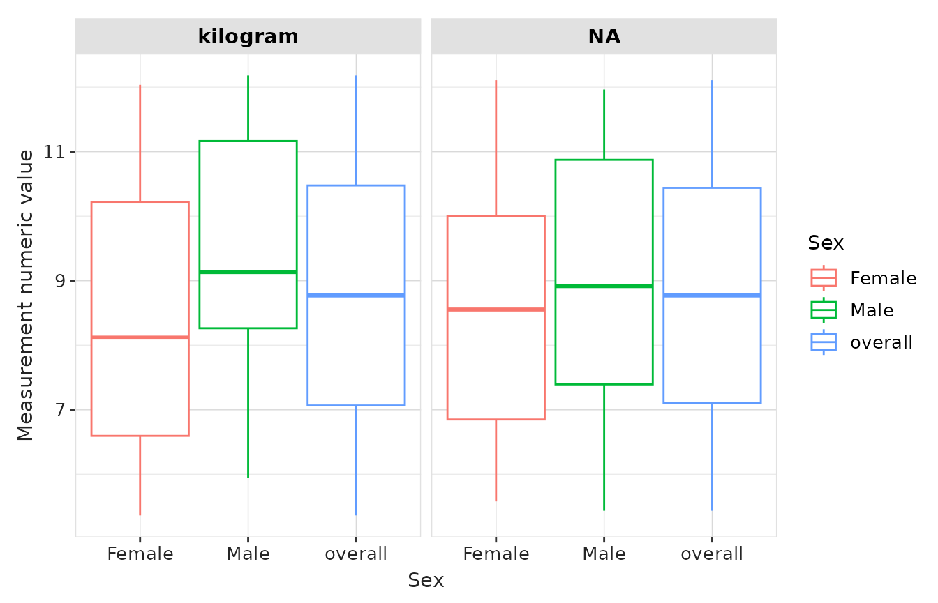
result |>
  plotMeasurementValueAsNumber(
    x = "sex",
    plotType = "boxplot",
    facet = "unit_concept_name",
    colour = "sex"
  )
densityplot
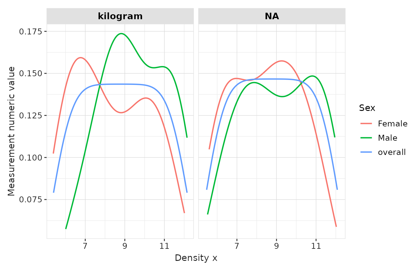
result |>
  plotMeasurementValueAsNumber(
    plotType = "densityplot",
    facet = "unit_concept_name",
    colour = "sex"
  )
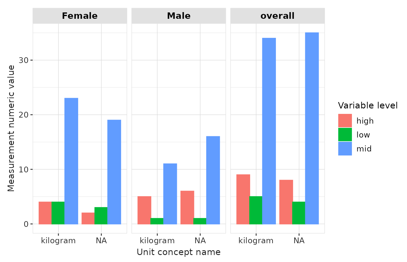
barplot
result |>
  plotMeasurementValueAsNumber(
    x = "unit_concept_name",
    plotType = "barplot",
    facet = c("sex"),
    colour = "variable_level"
  )
Concept-value summary
plotMeasurementValueAsConcept() visualises concept-coded
measurement values and their frequencies. Next we plot counts for each
concept value in the codelist.
result |>
  plotMeasurementValueAsConcept(
    x = "count",
    y = "variable_level",
    facet = "cdm_name",
    colour = "sex"
  ) +
  ylab("Value as Concept Name")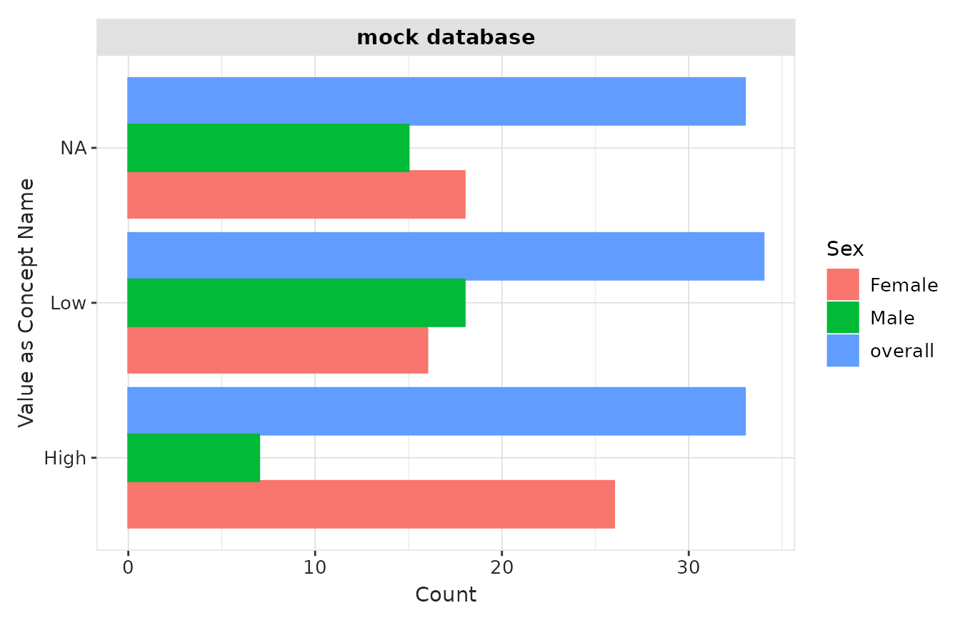
Instead of counts, we can also plot the percentage for each concept:
result |>
  plotMeasurementValueAsConcept(
    x = "variable_level",
    y = "percentage",
    facet = "cdm_name",
    colour = "sex"
  ) +
xlab("Value as Concept Name") 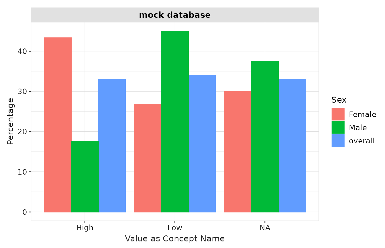
Visualisation with other packages
Shiny Apps with OmopViewer
The OmopViewer package supports results produced by MeasurementDiagnostics and provides a user-friendly way to quickly generate a Shiny application to explore diagnostic results in an interactive way.
For example, the following code exports a static Shiny app that allows users to navigate the tables and plots generated in this vignette.
library(OmopViewer)
exportStaticApp(result = result, directory = tempdir())
Customisation of plots and tables with visOmopResults
Tables and plots in MeasurementDiagnostics are
generated using the visOmopResults
package. Users who wish to create custom tables or visualisations
directly from a summarised_result object can do so by
leveraging the functions provided by this package.
Application of MeasurementDiagnostics in PhenotypeR
MeasurementDiagnostics is integrated into the PhenotypeR
package. When cohorts are defined based on measurement codes,
PhenotypeR automatically applies
summariseCohortMeasurementUse() to generate measurement
diagnostics during cohort construction, using the codelists linked to
each cohort.
This integration allows users to assess measurement codelists and cohorts as part of a broader phenotype development workflow.