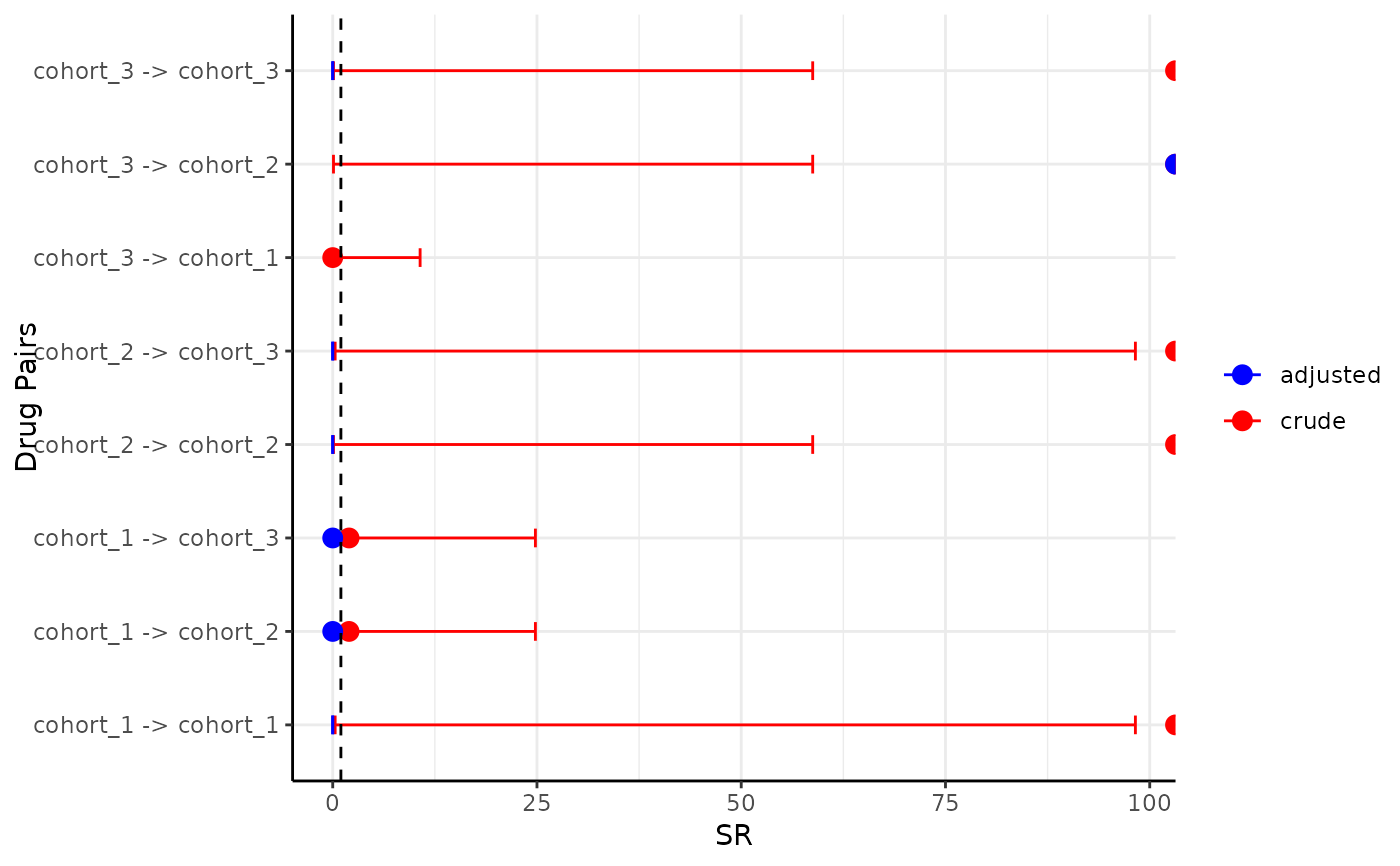
It provides a ggplot of the sequence ratios of index and marker cohorts.
Usage
plotSequenceRatios(
  result,
  onlyASR = FALSE,
  plotTitle = NULL,
  style = "default",
  labs = c("Sequence Ratio", "Index Marker Pair"),
  colours = NULL,
  facet = NULL
)
Arguments
- result
Table output from summariseSequenceRatios.
- onlyASR
If set to be TRUE then only adjusted SR will be plotted. Otherwise if it is set to be FALSE then both adjusted and crude SR will be plotted.
- plotTitle
Title of the plot, if NULL no title will be included in the plot.
- style
Style used for the plot. Passed to
visOmopResults::themeVisOmop().- labs
Axis labels for the plot.
- colours
Colours for sequence ratio.
- facet
The variable to facet by.
Examples
# \donttest{
library(CohortSymmetry)
cdm <- mockCohortSymmetry()
#> Creating a new cdm
#> Uploading table person (5 rows) - [1/11]
#> Uploading table observation_period (5 rows) - [2/11]
#> Uploading table cdm_source (1 rows) - [3/11]
#> Uploading table concept (3361 rows) - [4/11]
#> Uploading table vocabulary (65 rows) - [5/11]
#> Uploading table concept_relationship (117257 rows) - [6/11]
#> Uploading table concept_synonym (3895 rows) - [7/11]
#> Uploading table concept_ancestor (1327 rows) - [8/11]
#> Uploading table drug_strength (45 rows) - [9/11]
#> Uploading table cohort_1 (10 rows) - [10/11]
#> Uploading table cohort_2 (11 rows) - [11/11]
cdm <- generateSequenceCohortSet(cdm = cdm,
                                 indexTable = "cohort_1",
                                 markerTable = "cohort_2",
                                 name = "joined_cohort")
#> Warning: restarting interrupted promise evaluation
sequence_ratio <- summariseSequenceRatios(cohort = cdm$joined_cohort)
#> Warning: For at least some combinations, index is always before marker or marker always
#> before index
#> -- 5 combinations of 8 had index always before marker
#> -- 5 combinations of 8 had marker always before index
plotSequenceRatios(result = sequence_ratio)
#> Warning: Removed 3 rows containing missing values or values outside the scale range
#> (`geom_point()`).

CDMConnector::cdmDisconnect(cdm = cdm)
# }
CDMConnector::cdmDisconnect(cdm = cdm)
# }