
Step 5: Visualise temporal symmetry
Source:vignettes/a06_Visualise_temporal_symmetry.Rmd
a06_Visualise_temporal_symmetry.RmdIntroduction
In this vignette we will explore the functionality and arguments of a set of functions that will help us to understand and visualise the temporal symmetry results (produced Step 4: Obtain aggregated data on temporal symmetry). In particular, we will delve into the following function:
-
plotTemporalSymmetry(): to plot the temporal symmetry.
This function builds-up on previous functions, such as
generateSequenceCohortSet() and
summariseTemporalSymmetry() function.
Let’s regather the output from
summariseTemporalSymmetry()
temporal_symmetry <- summariseTemporalSymmetry(cohort = cdm$intersect)With this established, much like
summariseSequenceRatios(), the object
temporal_symmetry could then be fed into
tableTemporalSymmetry() or
plotTemporalSymmetry() to visualise the results:
tableTemporalSymmetry(result = temporal_symmetry)| Marker name | Estimate name |
Variable level
|
||||||||||||||||||||||
|---|---|---|---|---|---|---|---|---|---|---|---|---|---|---|---|---|---|---|---|---|---|---|---|---|
| -390 | -360 | -330 | -300 | -270 | -240 | -180 | -150 | -120 | -90 | -60 | 30 | 60 | 90 | 120 | 150 | 180 | 210 | 240 | 270 | 300 | 330 | 360 | ||
| GiBleed; aspirin | ||||||||||||||||||||||||
| amoxicillin | 30_days_ly_count | 1 | 2 | 1 | 1 | 2 | 2 | 3 | 7 | 2 | 5 | 4 | 4 | 1 | 3 | 2 | 1 | 3 | 3 | 5 | 6 | 4 | 6 | 4 |
plotTemporalSymmetry(result = temporal_symmetry)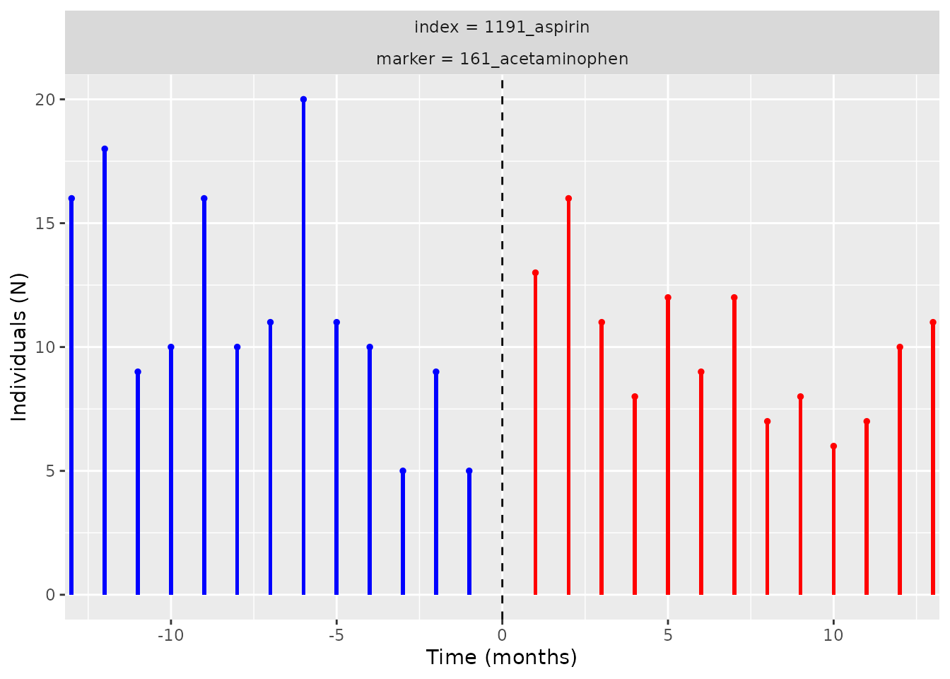
Note that the
axis is the time, which we recall to be the initiation of the marker
minus the initiation of the index. The unit of the time difference here
is 30 days as this is the default from
summarisTemporalSymmetry().
This is the end of the vignette, please cite our paper and let us know of any bugs or improvements we can make - have fun with the package!